Make sure {{#if ..} will only apply on Desktop Devices

My customer did not like the way the content is presented inside the below mentioned MOD IF ON MOBILE , and I think They might have a point here .

project: 8P24PE
Mod:

Depending on the “imageFirst”-Attribute, the HTML-Markup has a different structure.

If the pageload derives from a Mobile-Device though, I would like to ensure the HTML-Structure always has the same structure.

My current approach is to disable those IF-Clauses (see screenshot) ONLY IN SUCH CASES WHEN the user is surfing the page from a Mobile-device.

But I do not know how to accomplish that.

What can I do to make sure the {{ #if }}-clause only applies in case the user is on Desktop?

I would love a short hint from you :wink:

https://anymod.com/home

PS: I did consult the DOCS before I wrote you, but I found no solution there.

https://skysails.info/marine_performance/cts-product.html

https://anymod.com/mod/dkkomn?h1=69&h2=88&v=74

https://guide.anymod.com/guide/vue.html

https://handlebarsjs.com/expressions.html

I believe this could be accomplished by using flex-direction instead of how it’s currently done.

So something like this:

{{#each items}}
<div class="row my-5 {{#if imageFirst}}image-first{{/if}}">
  <div class="col-sm-6 ...">
    {{{ content }}}
  </div>
  <div class="col-sm-6 ...">
    <img ...>
  </div>
</div>
{{/each}}
.image-first {
  flex-direction: row-reverse;
}
@media (max-width: 575px) {
  .row {
     flex-direction: column;
  }
}

Does that make sense?

the code of my AnyMod has

{{#if imageFirst}}

as well as

{{#unless imageFirst}}

I know, I’m suggesting to remove that :grinning:

okay, I will look closer into your suggestion and think about it more :wink: Thank you for your quick support!

We are building some tools that will allow another user to clone your mod, make some changes and then you can merge some or all of it back into the original. It will be great for collaborations like this :+1:

I must admit your suggestion might not solve my issue.
I do not see the solution yet.
I will think about it even more.
Then I will provide you with another feedback.
Thank you again.

Okay, this morning I took the time to think deeper about your suggested solution to the mobile-problem this MOD has. And I must admit I came to the conclusion that your suggestion might not solve the issue. It might solve the issue IF I added a new additional class-name to the HTML-Markup though.

In order to be able to work with Flexbox inside of this Mod , I decided to introduce two new Classes, so that I will be able to assign the new nessesary flexbox-rules to the nessesary elements.

I will have to work with the mobile result of this mod much much more than I hoped for again.

I hoped to be able to drop in a “ready to go” plug and play Mod. But this Mod again is not ‘ready to use’ on mobile devices.

This mod cannot be used on Mobile devices as it is. I will have to improove it.

The Mobile apperance has the following issue: two pictures appear directly below one another .

While the order of the content on mobile should be :

Headline
Text
Image

Headline
Text
Image

Headline
Text
Image

Headline
Text
Image

The order of the elements in fact is

Headline
Text
Image

Image
Headline
Text

Headline
Text
Image

Image
Headline
Text

If you can see a better way to workaround the mobile issues this AnyMod Component has, then please let me know, in order for me to not loose more time than urgendly nessesary.

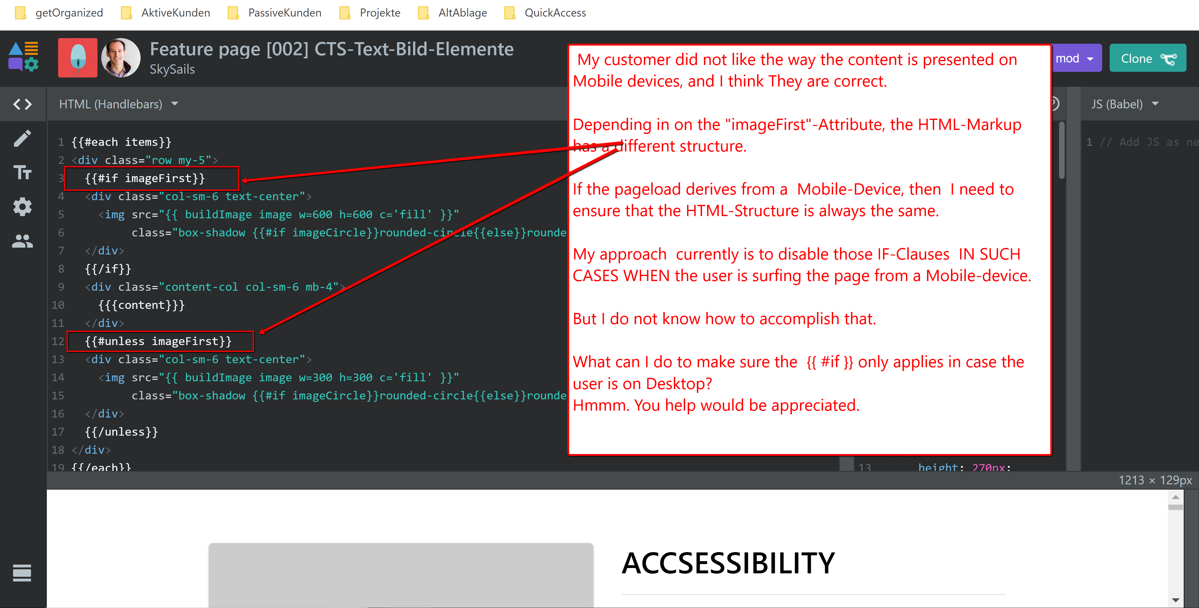
It might be smart to change the ATTRIBUTE (ImageFirst) whenever we are on a mobile device (as we dont want that effect on mobile). Do you think there is an approach to do that?

PS: You are a team-member (developer) on this anymod-Project, so you may create a clone and work there (it might save you the efford of typing lots of words:)

https://anymod.com/projects/8P24PE/dashboard

Hey Tyler, please also carefully read my new messages above. I just wanted to add the information, that my attempt to adress the issue on mobile devices cannot be solved with CSS currently, as the two new classes ImageMobileAtTheBottom and ImageMobileAtTheTop are too deep in the html markup. I would have to select the parent.parent of those new-class-elements in CSS.

I would need a propper way to adress the .row element . Currently there is no such approach. We would need to rewrite the html markup to get there.

But I still hope you might suggest to overwrite the ‘imageFirst’ attribute on mobile devices dynamically with the default value for the ‘imageFirst’ attribute.

https://anymod.com/mod/dkkomn

Here is the implementation of what I had in mind:

Is there something it’s not doing that you wanted it to do?

Hi Tyler,

this is a supercool method to present the altered code you developed for me!

The new Mod perfectly does what I hoped for! I Cloned your suggestion and then tested it.

Thank you Tyler!

I will additinally look deeper into your solution tomorrow. I did not yet understand it. I will have to look at it with more calm and time . I will do that tomorrow.

Have a nice and restful weekend !!

1 Like

Okay. From looking into it deeper, I learned how to set the additional classname into the row element. From there, it was indeed merely a flexbox-thing to reorder the direction of the child.elements on mobile devices.

I am happy to have learned how to set class using those handlebars, and happy to have the issue solved, and also to maybe know that the corresponding template mod might have improoved as well.

Thank you for your support !

1 Like