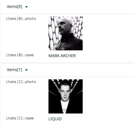
Have you thought about making the text on the edit window a little more user-friendly?

I can see my non-tech clients being a little intimidated by this.

Have you thought about making the text on the edit window a little more user-friendly?

I can see my non-tech clients being a little intimidated by this.
We’ve done a decent amount of testing with very non-technical users, and it hasn’t come up. I do see that it could be intimidating though.
Oh, cool. That’s interesting that it didn’t come up.
If I could give the collection a meaningful name, like Members, that would be great. Then titles could look more like Member Photo and Member Name
That would be a nice touch. So there would be a display name you could optionally add for each field.
Our goal is to make this easy for everyone, and that often includes non-technical users, so we’ll add this to our feature list
What we’ve seen is that it’s basically pattern recognition. If they see “My title” and want to change it, they’re just going to click anywhere that says “My title” etc
Excellent 
I’m going to put this live on 3 non-tech client projects this week so I’ll let you know if anyone has any issues with the editing.
That is great to hear. We’d love the feedback!